
Psychology Of Color
6 min read


You’re walking down a busy street, and a bright, cheerful yellow sign catches your eye. You feel a spark of happiness, even before you’ve read the words on it. Across the street, a sleek black storefront exudes sophistication, pulling you in with its air of exclusivity. What just happened? You’ve experienced the silent, powerful language of color—a language that speaks to us all, often without us even realizing it. Welcome to the fascinating world of color psychology in branding.
The Emotional Palette
Every color tells a story, and these stories are deeply embedded in our psyche. Red whispers urgency, passion, and excitement. Blue hums reliability and trust. Green sings of growth and harmony. These associations aren’t arbitrary; they’re shaped by both psychological triggers and cultural contexts. Think about the last time you walked into a spa. The soft greens and blues likely made you feel relaxed and serene, creating an environment of calm and rejuvenation. Now imagine a fast-food restaurant decked out in calming pastels. It feels off, doesn’t it? That’s the power of choosing the right colors for the right context. For businesses, understanding this emotional palette is key to building connections that resonate deeply with their audience.
Why Colors Matter in Branding
Branding is more than logos and slogans; it’s about creating an emotional connection. Colors play a massive role in shaping these connections. Research shows that up to 90% of snap judgments about products can be based on color alone. For brands, this makes color a strategic tool, not just a design choice. Luxury brands like Chanel or Rolex lean on black, gold, and silver to evoke sophistication and exclusivity. In contrast, tech startups often favor bold blues or oranges to signal innovation and approachability. The colors you choose can either draw your audience in or push them away. Effective branding requires understanding your audience and aligning your color choices with their expectations and emotions.
The Psychology Behind Popular Colors
Red: The Bold Attention-Grabber
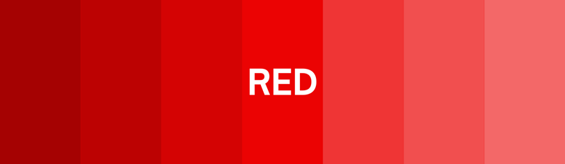
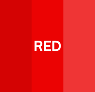
Red is a color that demands attention. It’s bold, energetic, and often associated with urgency and excitement. Brands like Netflix and YouTube use red to keep us hooked, leveraging its ability to evoke strong emotions. But red isn’t just about excitement; it’s also the color of appetite. This is why fast-food giants like McDonald’s and KFC prominently feature red in their branding. The psychology behind red’s appeal lies in its ability to stimulate the senses and create a sense of urgency, making it a popular choice for calls to action.
Blue: The Trust Builder


Blue is the most universally liked color, often associated with trust, reliability, and calmness. Banks like Chase and tech giants like Twitter use blue to convey stability and dependability. It’s a color that works well across cultures, making it a safe bet for global brands. Blue’s calming effect also makes it ideal for industries that want to build trust, such as healthcare and finance. It’s a color that reassures and instills confidence, making it a cornerstone of many successful branding strategies.
Green: The Nature Lover
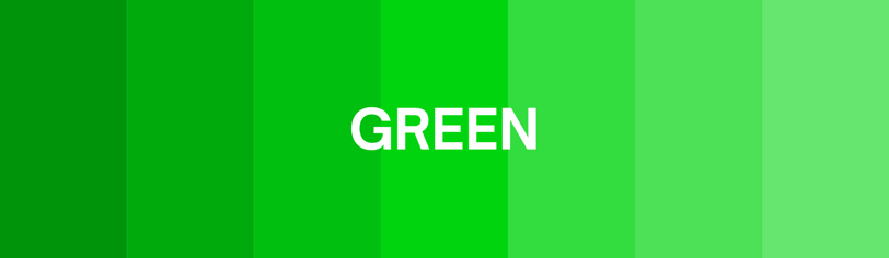

Green is synonymous with growth, health, and sustainability. It’s the go-to color for eco-friendly brands and companies that want to emphasize wellness. Think Whole Foods or Spotify—brands that connect with nature or creativity often lean on green. The color green has a calming effect and is often used to symbolize freshness and renewal, making it a favorite for brands that prioritize environmental consciousness and holistic well-being.
Yellow: The Optimistic Energizer
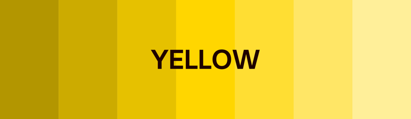
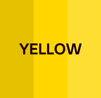
Yellow is the color of sunshine, optimism, and energy. It’s bright and attention-grabbing, often used to convey cheerfulness and positivity. Brands like IKEA and Snapchat leverage yellow to evoke feelings of happiness and creativity. However, yellow can also be overwhelming if overused, so it’s often paired with neutral colors for balance. The key to using yellow effectively lies in its ability to inject energy and warmth into your brand, making it approachable and memorable.
Black and White: The Timeless Classics

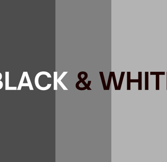
Black and white are the ultimate colors of sophistication and simplicity. Black exudes luxury, power, and elegance, making it a favorite for high-end brands like Chanel and Nike. White, on the other hand, represents purity and minimalism. Together, they create a timeless aesthetic that is both modern and classic. These colors are often used as a foundation, allowing other colors in the palette to shine while maintaining a sense of balance and harmony.
Cultural Nuances in Color
Colors don’t mean the same thing everywhere. In Western cultures, white often symbolizes purity, but in some Eastern traditions, it’s associated with mourning. Red can mean love and passion in one country but signify luck and prosperity in another. If your brand operates globally, understanding these cultural nuances is crucial. For example, Coca-Cola’s iconic red works well worldwide, but a brand targeting a Middle Eastern audience might opt for green, a color associated with Islam and prosperity. Knowing your audience’s cultural context can make or break your branding strategy. Tailoring your color choices to align with cultural perceptions ensures your message resonates universally.
The Science of Color Combinations
While individual colors are powerful, the real magic happens when they work together. Complementary colors—those opposite each other on the color wheel—create contrast and energy. Analogous colors—those next to each other—offer harmony and cohesion. Think about Google’s logo. The combination of blue, red, yellow, and green isn’t random. It’s designed to be playful, diverse, and inclusive. On the other hand, brands like Tiffany & Co. rely on a single iconic color—Tiffany Blue—to create a strong, memorable identity. Choosing the right color combinations can enhance your brand’s visual impact and emotional appeal, creating a cohesive and engaging experience for your audience.
How to Choose the Right Colors for Your Brand
Choosing the right colors for your brand is both an art and a science. Here’s how to approach it:
Understand Your Audience: Who are you trying to reach? A younger audience might resonate with bold, vibrant colors, while a more mature demographic might prefer muted tones.
Define Your Brand Personality: Are you fun and quirky or serious and professional? Your color palette should reflect that personality.
Test and Iterate: Don’t rely on assumptions. Test your colors with real audiences to see how they respond.
Think About Versatility: Your colors need to work across different mediums—from websites to packaging to social media.
Consistency is also crucial. Once you’ve chosen your colors, use them consistently across all touchpoints. This builds recognition and strengthens your brand identity.
Beyond the Logo: Using Colors Strategically
Colors shouldn’t just live in your logo. They should be a consistent part of your brand’s visual language. Use them in your marketing materials, website design, and even your office spaces. Consistency builds recognition and trust. For instance, Starbucks doesn’t just use green in its logo; it’s woven into the design of its stores, cups, and even its app. This consistency reinforces the brand’s identity and makes it instantly recognizable.
Wrapping It Up
Color is more than just a visual element; it’s a psychological tool that can shape perceptions, evoke emotions, and drive decisions. When used thoughtfully, colors can transform your brand from forgettable to unforgettable. So, the next time you’re choosing a palette, remember: you’re not just picking colors; you’re crafting an experience.